Here is how corny it looks with a background image - it would have been great five years ago, perhaps:
Here is how corny it looks with a background image - it would have been great five years ago, perhaps:
There are four kinds of pages right now:
Front page -> http://testing.jacmoe.dk/
Basic page -> http://testing.jacmoe.dk/download.html
Page with affix, perhaps for wiki entries? -> http://testing.jacmo…quickstart.html
Full blown, fluid layout documentation page -> http://testing.jacmoe.dk/guide.html
Need to handle the pre/code stylesheet because it does a poor job of handing the layout - any tricks are welcome.
Except the sections on the front page and some style issues here and there I am satisfied with it overall.
Heck, I am a programmer and not a designer, but I think that it already looks better than both the current site and the site that I stole the design from in the first place ![]()
Hey
The download page when I try to scroll down it doesn’t work, but I like the design except the gradient on the right side (but that its me, I never liked gradients)
The other pages they look good, great job ![]()
Regarding the homepage hero, maybe an image is really to much but I think that we can’t leave it just in blue, I personally like the way it is done on this website:
YiiBooster
It’s clean and nice in my opinion, what do you think?
Love docs header navigation.
About the indentation issues with the pre>code blocks:
I almost lost my mind completely and was ready to give up…
Okay, I admit: I gave up.
Then, as always, when you finally - after an agonizing struggle - do cave in and give up…
a solution presents itself ![]()
I am using a small static page generator called Panini (Zurb) and it uses Handlebars which apparently idents your output, unless you configure it to not do it.
https://github.com/w...s.js/issues/858
So the funky indentation will not be in the live version of the (potentially) new Yii site.
whew
So, basically what happened was that I wrote this code:
<div class="col-sm-8 col-lg-8">
<div class="content page">
<pre><code class="php">$config['plugins']['infostreams\\snippets']['snippets'] = array(
'clearfix' => function($text=null) {
return "<div class=\"clearfix\"></div>";
},
</code></pre>
And ran it…
And sneakily this was sent to the browser:
<div class="col-sm-8 col-lg-8">
<div class="content page">
<pre><code class="php">$config['plugins']['infostreams\\snippets']['snippets'] = array(
'clearfix' => function($text=null) {
return "<div class=\"clearfix\"></div>";
},
</code></pre>
I tried with a gradient (radial and circle) and it did not work out.
I also tried with a background image and it didn’t work out either.
It seems like no matter what I do, it always ends up with that blue background.
It’s extremely effective together with the logo.
Yes, I know it’s Blue, but it is the most effective design that I am able to cook up.
I don’t think that a white background and some fancy SVG stuff in Material Design colours will make Yii stand out.
To the contrary.
It will end up looking as corny and bland as 1000s of other websites.
Besides: who gawks at the front page all day long?
Except for me, I mean… ![]()
What I think is more important is how the site works when reading about Yii, and I am fairly happy with the result.
The biggest problem right now is that there is a ton of legacy information on the site about Yii 1.
It should not be prominent anymore.
Still supported, of course, but not the default.
Like the Yii tour, the screencasts and the performance benchmark…
I am not sure how much of that is hosted in the Github repositories, but I am sure that it is too much work to take on for the Yii team…
EDIT
I removed the gradient from the ‘download’ page’s sidebar well - to be frank: I don’t care for gradients myself either… ![]()
EDIT_again:
I added something to the docs page.
Some buttons to reduce the number of dropdowns in the main menu and to provide a more integrated experience.
6813
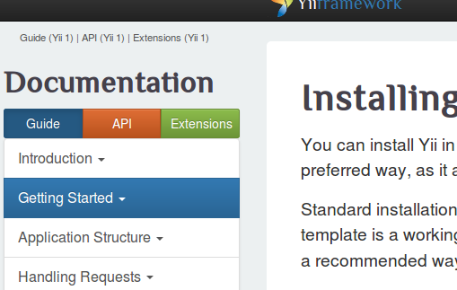
Could be fun to give the three sections each their own nav color: blue for guide, yellow for API and green for extension docs.
I threw in a small gradient into the big blue… ![]()
If you think that the site is very blue, let me tell you that the Bootstrap site is very purple… http://getbootstrap.com/
Good ideas overall.
The http://testing.jacmoe.dk/guide.html page now has three working buttons (guide|API|extensions) try them ![]()
And notice the ‘Edit this page’ link…
There is also a scrollup button for your convenience.
I think now would probably be a good time to decide on maybe porting to Bootstrap 4 because it is much better: they switched from Less to Sass and from pixels to ems, but it would mean that we don’t cater for IE8 users, but I guess none of our target group are using that. ![]()
Check out the almost-relased Bootstrap 4 here: http://v4-alpha.getbootstrap.com/
I am stoked that it now uses Sass to the max ![]()
The migration notes are probably the best place to start: http://v4-alpha.getb…com/migration/
EDIT:
I also think that perhaps YiiFeed and YiiGist should be integrated with the site.
That would be awesome.
I see no reason why they should be tucked away like that. Should be a prominent part of the Yii site IMO.
jacmoe: I really like what I see from your screenshots! I am really busy right now so I had no time to read all of this, but I wanted to announce that today we decided to make the new website’s code open source:
Would be great to have you as a contributor!
Thanks CeBe ![]()
And what great news!
I will check it out.
You made the right decision, I am sure.
[color="#006400"]/* forking - cloning */[/color]
I also like the design of that.
But I think that my take has got more identity ![]()
It was fairly painless to download, install and setup - but Latex sure is a bitch.
I am still pulling down half of the worlds packages…
What I will do now is do my theme on top of it, using Sass instead of Less and Gulp instead of Grunt, but I will not change much.
That will be stage two…
OK, so Yii Camp … sounds intriguing ![]()
Ok, so I forked and cloned and hacked a bit, and I like the overall idea of it.
However, I will see if I can combine the best of both, so I have made a branch.
Have already converted the Less to Sass and the Grunt to Gulp.
Gulp is so much faster than Grunt, btw. ![]()
And there is browsersync included in the script.
Jacmoe, I think we’ll drop an idea of YiiCamp for now since SSO is kind of blocker issue that prevents us to move forward…
Jacmoe, please don’t do giant pull requests. One thing at a time, OK?
I did create a separate branch in my fork so don’t worry.
I am not sure what’s the best way to approach this since I can’t issue 10-30 PRs a day ![]()
Tell me how I should do it.
What I have now is basically the old theme ported to Sass and now using Gulp instead of Grunt.
So I could actually merge that into my master and issue a pull request now ![]()
Because what I do from here is changing things quite a bit.
I should probably make a new fork, and chop things up - you are right. ![]()
Because there is a favicon update in the middle of it all that should have been a separate PR.
I guess you can tell that I am used to be a lone wolf developer. ![]()
Update:
Note: yes, there will be more sections on the front page - news, latest gossip, etc.