New design and development of yiiframework.com

hello,

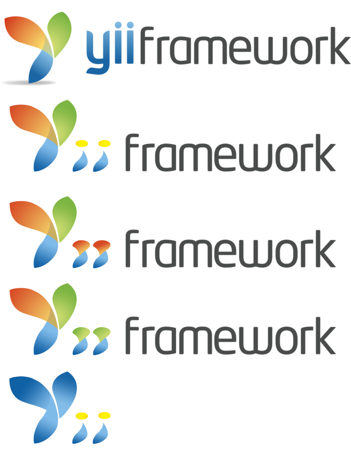
the logo is pretty good and fits into the presented design concept , but i was missing that the logo doesnt assemble all three letters from "Yii" into one design approach !

one kinda reads : "why yii framework ?" :wink:

this fundamental question was answered in the current design approach from the start, advertising and stating "easy, efficient, extensible" and explained intuitive the branding of the framework: "The name Yii (pronounced as Yee or [ji:]) stands for easy, efficient and extensible."

in the future design this isnt picked up so far, and got replaced by "fast, secure and professional" and i agree that one cant pick up those two punchlines and integrate it into one logo concept, that would only irritate and mess up the simplicity.

however one can distinguish: Yii "the easy, efficient and extensible" framework, as "the simple way" to "built fast, secure and professional" web applications !

ofc the new credo aims for an more mature impression, achieves it within the concept imo, but mayb the philosophy of yii can be included somehow and persuades every developer to join the "Yii side of life" :wink:

mayb those questions wont be raised by the newcomers stumbling over yiiframework.com, but putting it all together might cause an even greater effect!

it would be nice if the logo concept would be picked up to create some labels for Zii and Gii.

i read and respect, that the decision about the logo is made, but i couldnt resist not to quickly implement my thoughts. mayb those 3 letters assembly could be picked up on the zii or gii labels ?!

keep up the great work

748

yii-logo-transparent3.png

Yes

I like easy forms. Something like this 751

yii-3.jpg
. Easy to use as balck/white, negative/positive. Possible to make variations like Zii, Gii …

It seems people are more interested in the logo than other things. ;) I think we should stop discussing about the logo because it won’t lead us to anywhere. If you still like to play with the logo, please start a new thread. For your convenience, I also included the vector version of the logo in the first post.

I think the things that need most of our attention as of now are the following:

[b]

  1. the layout of the homepage. We are largely settled down with the current design. However, your suggestions are welcome.

  2. the copywriting on the homepage (words like: "The agile PHP framework…fast, secure, professional"). We are not 100% satisfied with the current writing. It would be great if you could help come up with some better copywritings.

  3. you good words about yii (will be used as the quote on the homepage). Please PM me with with your quotes, name, title, company name and URL.

[/b]

Mockup

(with "JS Slideshow" I mean something like this: http://www.liferay.com )

(with “Logo” I mean the logo without the shadow :D )

ekerazha@

I like it. Great!

Thank you :D Waiting for feedback from qiang

I don’t think qiang will release the Yii Site source (security).

@ekerazha

Usefull tool for wireframing. Could help

I use balsamiq however it seems a good alternative, thank you.

@ekerazha: thank you for your proposal of a new layout. I think we will keep our header unchanged. We may adjust the FSP part and below (yii sites, news, quotes, etc.)

The current header design is based on our analysis of existing open source project websites and the trend in layout design. It is a bit unusual with a menu bar filling the header region. We also try to avoid using slide show in the homepage, which feels too flashy and requires users to interact or wait to see full content.

I’m keen of web design and usability too. Having a menu on the same line as the logo is common when you have a few items, indeed I noticed your mockup has less menu entries than the current site. Example: there’s a “Community” entry instead of Extensions+Forum etc. and I think it’s not a good choice because the Extensions area should have a better visibility. Also, it lacks the Home entry: although it’s common to use the logo as a link to the home page, I think it’s a poor choice from an usability point of view… the logo is the logo, the navigation bar is the navigation bar. So, I thought to move the menu bar below the logo (this is very common too) so you’d have a larger area in order to place the proper number of menu entries. Also, I think the trend is to have user-centric sites, so the area that we have on the right of the logo could be better fitted with Login|Register links (before logging in) or an user badge (after logging in). Just my 2 cents :)

Ok. Yeah, there are pros and cons.

ekerazha

I can’t agree with “the logo is the logo”. Logo as a link to homepage is a very common usability pattern. It’s really useful and users are used to it.

The main menu is a dropdown menu. Its structure is the same as the sitemap in the footer.

As samdark said, since everyone is used to clicking on the logo to return to the homepage, why don’t we make it simpler by dropping “home” from mainmenu? apple.com does the same thing.

But it’s better to have the navigation under the logo, that’s what he pointed out. I agree with that. So I think navigation should be under the logo + it should have a Home-link like it has now. Also the width of the search field can be increased so everything fits well. Maybe it’s also possible to add a combo-box to the search field.

Yeah, it’s very common… a very common error in my opinion. Using the navigation bar “for everything expect for the Home link because it’s on the logo” is just not consistent (and not always obvious for unexperienced users, although this could be a minor issue for a programming framework website) :)

I’m in favor of “logo in line with menu”. It saves a lot of valuable space on the top of the page. And even if some consider linking the logo as an “error” - you sometimes have to accept widely adopted standards. I would expect that link. And i wouldn’t miss a home link. Check the big popular sites. Most of them don’t have a “Home” link anymore.

The only “standards” are W3C standards. “De facto” inconsistencies are not “standards”… just like using oil on skin burns, it’s common but wrong. It’s a conceptual error, I used logos as link-to-home too, then I understood it was an usability misconception. I remember the first time I visited a site with a logo-link to home (it was about 10-12 years ago I think), I just couldn’t find that blessed link eh eh. However these are only suggestions, obviously this site is not mine :)

As ekerazha stated the HOME link is for usability and for standard… the link on the logo could stay too, but it’s user frendlyer to have even the HOME link

Some space could be obtained if the logo is in two rows… "YII" in the first row… "framework" in the second row (below)…

Qiang, can you ask your designer, or maybe you know, what font was used to make the logo. I would like to make compatible logos for my projects.

Thanks.