Coding Ergonomics

He-he, yeah, that’s Yii2 in progress.

qiang, have you tried enabling cleartype and using cleartype-optimized fonts such as Consolas? I’ve spent lots of time without it and when I’ve finally turned it on my eyes felt better.

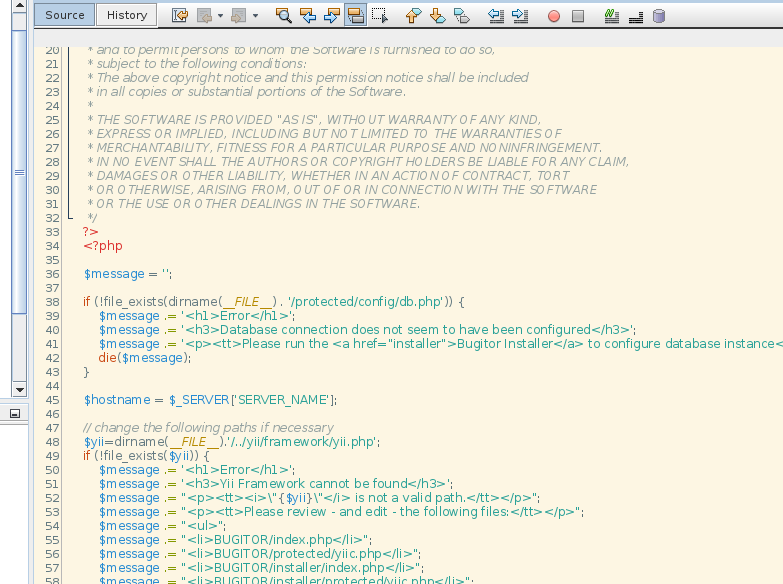
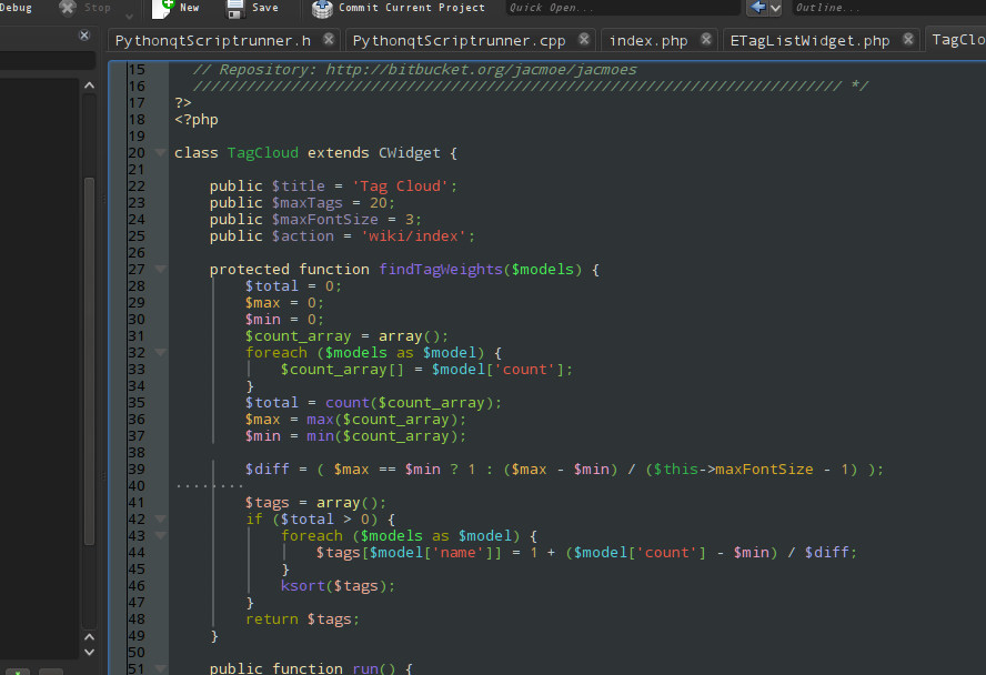
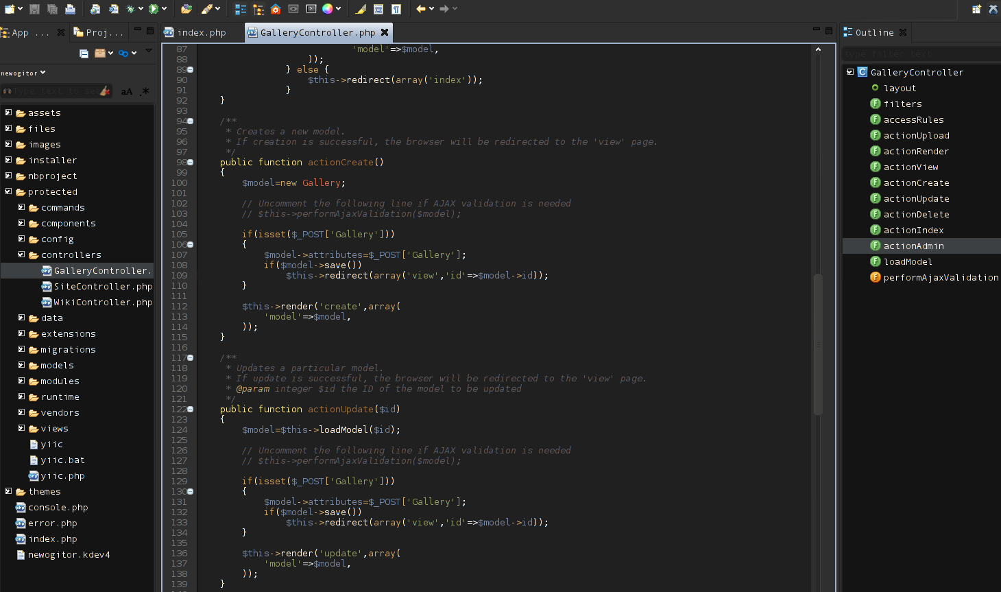
nkd, and again I don’t see why it’s good when code is on black but panels are still very bright.

Interesting. So if we want to see more of Yii2 before the alpha gets released we just need to trick the core devs into posting more screenshots of their IDEs? :lol:

You can check our gists as well https://gist.github.com/2835927

But that’s not as much fun :P Not to mention that those gists do not necessarily reflect the current state of development.

Yeah, but that doesn’t help with Java - that screenshot does look a bit like Netbeans or other Java-based IDE.

That’s a royal pain in the rearside.

No matter how much cleartype you set for your window manager, it doesn’t apply to Java which has it’s very own font rendering engine. :(

@samdark: I’m using Monaco TTF (it is shipped with Mac OS). My screenshot was taken through RDP, so the font looks very edgy. I was using Consolas before changing to Monaco.

@jacmoe: I’m using PhpStorm with some UI customization.

I’m gradually moving towards Mac OS. I found my productivity improves a lot once I master a lot of keyboard shortcuts, and these IDE’s do help a lot.

Finally - the font rendering problems in Netbeans has been solved! :lol:

In <netbeans>/etc/netbeans.conf, I append those options to 'netbeans_default_options’ :


J-Dswing.aatext=true -J-Dawt.useSystemAAFontSettings=on -J-Dorg.netbeans.editor.aa.extra.hints=true

Now, the font rendering is acceptable!

And, if you want a different color scheme then here’s some alternatives:

Zenburn:

http://netbeans.org/...2-07/message/23

Solarized:

https://github.com/f...olors-solarized

Oblivion-revival and Monokai:

http://codesleepshre…al-and-monokai/

Yeah, I think I’ll try with Solarized. :)

I am old and my eyes needs less contrast - hence me favoring dark color schemes.

Solarized Light:

3300

netbeansSolarizedLight.png

I’ve had a closer look at this Monaco font now. I don’t think I’d want to code with that: For my liking, it has a bizarre scale, effectively wasting more vertical space than needed and making it a bit hard to read.

By the way, there is a nice round-up of coding fonts over at codinghorror.com.

Just tried Monaco TTF. It’s better than consolas but there’s one thing if you’re going to use it. Do not use bold styling for your code. With Consolas it’s OK but with Monaco bold looks awful.

jacmoe, then you should go further and change everyhting else to be dark. Working with dark code while panels are white… I think it is a lot worse than working with everyhting white.

I’m using PhpStorm right now with Solarized Light (with a few customizations) and Adobe Source Code Pro. All is good.

The only thing that drives me crazy is PhpStorm’s light bulb.

You’re right. :)

Now, I need to figure out how to make Netbeans change colors.

It totally ignores my KDE theme.;)

Latest PHPStorm has some dark UI styles, as I know. These aren’t as good as light ones but at least they’re dark.

Now I abandoned all Java based IDEs, and switched to my favorite C++ IDE KDevelop.

It does PHP too! :)

With excellent code intelligence, and even features code completion, etc for Yii.

Here’s how it looks with KDE color style Obsidian Coast and the Oblivion Kate color scheme:

3301

kedevelopOblivion.png

It looks good, jacmoe!

Now try Solarized Dark ;) It look very good.

Okay - last one from me:

3302

aptanaLinux.png

Decided to try Aptana Studio again.

Default Aptana color scheme - and Aptana seems to take my current KDE (window manager) color config into account. Nice move! :)

Now that’s truly dark IDE.

You’re damn right. :lol:

To be honest, I went back to regular light grey with light solarized color scheme. :)