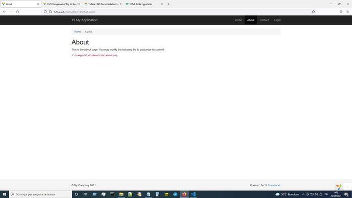
I have all GridView and DetailView width at 60% of screen resolution; i looking for some setting that change this situation, but i found nothing.
Where i can change something to have my site on all screen ?
Thanks
I correct something:
before don’t show footer and all are translated to left, i don’t know why.
I copy some files from Yii example, and now it’s good for me.
Now i need to enlarge page, reducing the width of margins, i think.
I see header and footer along all screen: i would also page inside along all screen or more larger.
I try adding some commands in main.php and also with site.css, but i have no result.
How can i do this ?
Thanks
Hi @Drugo66,
Modify the source code of "view/layout/main.php" like the following:
...
<div class="wrap">
    <?php
    NavBar::begin([
        'brandLabel' => Yii::$app->name,
        'brandUrl' => Yii::$app->homeUrl,
        'options' => [
            // 'class' => 'navbar-inverse navbar-fixed-top',
            'class' => 'navbar-inverse',
        ],
    ]);
...
<!--  <div class="container"> -->
    <div class="container-fluid">
...
<div class="container-fluid"> is the key. It will give you a 100% width container, instead of the default responsive fixed width container.
Tip: Also removing “navbar-fixed-top” class from the NavBar is required to render the breadcrumbs correctly when the container is “fluid”. This may be yii2 specific, though I’m not very sure.
Check the documentation of bootstrap.
Thank you so much, @softark: it works.
Now i want only to adjust header visualization.
Thanks again.
A navbar-fixed-top version of main.php
<div class="wrap">
    <?php
    NavBar::begin([
        'brandLabel' => 'My App',
        'brandUrl' => Yii::$app->homeUrl,
        'options' => [
            'class' => 'navbar-inverse navbar-fixed-top',
        ],
        'innerContainerOptions' => [
            'class' => 'container-fluid',
        ],
    ]);

    ...

    NavBar::end();
    ?>

    <div class="container-fluid">
        <?php
        $links = blabla ...;
        echo Breadcrumbs::widget([
            'links' => $links,
            'options' => [
                'class' => 'breadcrumb',
                'style' => 'margin-top: 70px',
            ],
        ]) ?>
        <?= $content ?>
    </div>
</div>
Breadcrumbs must have extra margin-top (around 65 to 70 pixels), or else it will be hidden behind the NavBar when it is fixed on the top.
Thanks again @softark, but in this way breadcrumps are in vertical.
What is the difference with navbar-fixed-top and without it ?
I don’t see difference …
Thanks
I have examined the issue a little more, and found that a fix in "site.css" is the most appropriate solution.
site.css
/*
.wrap > .container {
    padding: 70px 15px 20px;
}
*/
.wrap > .container, .wrap > .container-fluid {
    padding: 70px 15px 20px;
}
And you can revert the breadcrumb’s code.
    <div class="container-fluid">
        <?php
        $links = blabla ...;
        echo Breadcrumbs::widget([
            'links' => $links,
            //'options' => [
            //    'class' => 'breadcrumb',
            //    'style' => 'margin-top: 70px',
            //],
        ]) ?>
        <?= $content ?>
    </div>
Sorry for delay to answer, but i’m very very busy.
Thank you so much, now it’s perfect.
Only one thing: in the way you wrote, it don’t work; i have to separate in this way:
.wrap > .container {
    padding: 70px 15px 20px;
}

.wrap > .container-fluid {
    padding: 70px 15px 20px;
}
Thanks again
